What does this mean? Teaching students to analyze graphs

Once students have learned how to correctly graph their data, the next step is for them to figure out what that graph is telling them about their data. In past years, I would talk to students about identifying trends, or looking at specific points on the graph, but I didn’t have a very robust lesson on graph analysis. That all changed in the summer of 2017 when my colleague and I went to the Stanford Academy for Excellence in Biology Teaching, a weeklong training offered by the Stanford Graduate School of Education Center to Support Excellence in Teaching (CSET) – whew, that’s a mouthful! The training incorporated a lot of information and strategies from the AP Biology Teacher Academy that was developed in partnership with BSCS, NABT, and HHMI Biointeractive. (If it’s offered in the future, consider doing this course – it was well worth it. I also participated in the year-long follow-up to earn graduate credit from Stanford.)

One of the lessons we learned was the BSCS Identify and Interpret (I2) Strategy. This strategy has students break down their analysis of a graph into two parts. The first is the Identify step, also known as “What I See”. In this step, students are identifying changes, trends or differences. The idea is that they are looking at the big picture, without a lot of specifics. They mark places on the graph where they see a particular change/trend and identify what the change or trend is. The second part is the “Interpret”, or “What It Means” step, where students assign meaning to their “What I See” observations. There is a final step in the BSCS strategy where students write a caption that summarizes the information and where students can demonstrate their understanding of the data. (Instead of having students write a caption, I had them write a supported conclusion.)

I did some direct instruction on the strategy, giving students the BSCS “What I See/What It Means” (WIS/WIM) examples, along with what they were supposed to do for each part of the strategy. Next, we looked at a sample graph – I had the graph projected on the board, so I started with an example where I identified a point, then wrote a WIS statement. I gave students a few minutes to mark their WIS points and make observations. Then I had students come up to the board, identify their WIS point, and wrote a WIS statement on the board. After all of the important points were identified, I wrote an example WIM statement for the WIS point I identified, then gave students time to come up with WIM statements for the WIS points we had on the board. Again, students came to the board and wrote WIM statements that corresponded to the WIM statements.

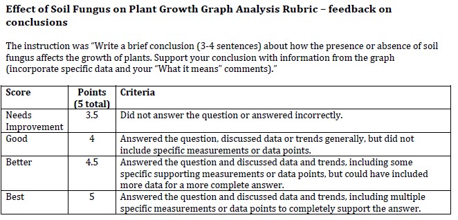
It seemed like they got it, so I gave students a handout with another graph for practice in the same class period. The handout* included a graph, a grid to write down their WIS and WIM statements, and a third page that gave them room to write a 3-4 sentence conclusion about how the presence or absence of soil fungus affected the growth of plants.

The WIS/WIM grid

When students finished their graph analysis, I collected the handouts. I wanted to give them a quick turnaround for feedback, so I graded them before the next class session. My feedback focused solely on their written conclusion. The assignment was worth 5 points, so I created a rubric and included student sample answers for each point value so students could see what each criteria looked like.

The basic rubric – see the handout for student sample answers

Honestly, the “What I See” step was the hardest part for my students. They could easily identify points on the graph that seemed to be important, but went right for explaining what it meant. Instead of saying “non-sterilized has a steeper slope compared to sterilized soil” for their WIS statement, they would say something like “plants grew better in non-sterilized soil than sterilized soil”. In general, though, their conclusions were pretty good, especially considering I hadn’t taught them anything about Claim-Evidence-Reasoning yet!

Later in the year, my colleague instructed students that the WIS statement should only identify a point/range on the X-axis and make an observation about what was happening at that point or range. She also instructed students that the WIM statement should describe how the X-axis affects the y-axis. I went back and had students add this information to their earlier notes, and this clarification seemed to help.

All told, this is a great strategy to help students learn how to thoroughly analyze their graphs. I think it helped them write solid conclusions, because they had identified specific parts of the graph that they could then incorporate into their conclusions. If I had reinforced the strategy more throughout the year, students would have been more comfortable with it. My goal for next year is to have a “What I See/What It Means” practice graph for each unit.

*When I print the handout for my students’ notebooks, I print it two sided, with two pages on each side. They can fold the handout in half to make a booklet that fits on one page in their composition book. My colleague joked about me making booklets, but when I taught in public school, I had to buy copy paper myself, so making booklets was an easy way to save paper.

Teaching basic graphing skills

One of the first lessons I teach each year is graphing. Now I don’t know about you, but for my students (9th grade), everything is a bar graph. EVERYTHING. I don’t know where this idea gets embedded in their brains, but it’s probably one of the hardest habits to break. I start early, reinforce it often, and grade consistently throughout the year. And, what do you know, by the end of last year, all of my students were using the appropriate type of graph!

For my biology students (regular level, 9th graders), I keep it simple. I’m only going to teach them to differentiate between line graphs, bar graphs, and pie charts. I’m teaching them the foundation and leaving it to other teachers (their math or future science teachers) to get more detailed, with concepts like scatterplots, lines of best fit, error bars, etc.

I’ve always taught scientific graphing, even before I was fully immersed in NGSS, but seeing how this fit into the Crosscutting Concepts (I’m going to abbreviate it as CCC from here) just reinforces the importance of graphing. The best fit of graphing in to the CCC is in Patterns, Cause and Effect, and Scale, Proportion and Quantity. (In addition, NSTA has prepared a great matrix of the CCC.) In the Grades 6-8 Patterns section, the matrix explicitly says that “graphs . . . can be used to identify patterns in data.” A well-plotted graph can show the relationship between a manipulated/independent variable and the responding/dependent variable. From there, students can infer cause and effect.

I have students take notes on graphing on a foldable that gets glued in their notebooks. During the presentation, we discuss what a “good” graph includes, and when to use each kind of graph.

Graphing foldable for student note-taking

There are a couple of useful acronyms that I give my students to help them remember how to properly graph their data. The first is “DRY MIX” – “DRY” means that the Dependent/Responding variable goes on the Y-axis, and “MIX” means that the Manipulated/Independent variable goes on the X-axis. I like this acronym because some textbooks or teachers will use the terms manipulated and responding to refer to variables, while others will use independent and dependent, so this acronym covers both of those bases.

The second acronym I give my students is “TAILS”. I wish I remembered where I first found this acronym, because it is so useful!

  • T stands for Title – I teach my students that their title should explain the relationship between the independent variable the the dependent variable. (I ask them to make a title that explicitly states the relationship – if they’re at a total loss, I give them a standard template of “Effect of -IV- on -DV-“.)
  • A stands for Axes – this incorporates the DRY MIX acronym to make sure the variables are on the correct axes.
  • I stands for Intervals – the number intervals on the axes should be evenly spaced.
  • L stands for Labels – the axes should be labeled with the variable and units, and there must be a key/legend if there are multiple lines or categories.
  • S stands for Scale – I tell students that their graph should take up as much space on the graph paper as possible, usually at least 2/3 or 3/4 of the space. No teeny-tiny graphs, and no graphs that go outside the boundaries of the grid (which means don’t draw your own lines at the top or right of the grid).

At the bottom of the foldable, I explain when each type of graph is appropriate. With line graphs, I struggled with how to explain it to students in a general enough way that they got it. “Tracking continuous changes in the independent variable” was confusing and not exactly correct. When I looked at the CCC, the light finally came on – a line graph is used to show the cause and effect relationship between the variables. To state it as a question, “As the scientist changes the independent variable, how does that affect the dependent variable?” I will still keep the “continuous data” part of it to help students see that if there is a continuum of the units for the independent variable, then a line graph is the best choice.

The categories of the TAILS acronym get incorporated into a 10-point grading rubric (which I won’t post because it’s not my own work product). Students get a copy of the grading rubric at the beginning of the year, and it is glued into the reference section of their science notebook. I also made a mini-rubric summary (just the categories and point values) that I print out – when I grade, I can just circle the point awarded for each category. I staple the mini-rubric to their paper so students can see where they lost points.

What I noticed last year was that by explicitly teaching graphing skills AND consistently using the graph grading rubric all year, students quickly developed their graphing skills. Most students were graphing at the 9.5-10 point level by the end of the first semester. The biggest challenges seemed to be in crafting a graph title, and in figuring out the intervals on the axes. By the end of the school year, when students were crunching data for their final projects, every student was using the appropriate graph for their data, and was correctly graphing their data.

Quick Takes: Fill-in-the-blank review races

I love a good Kahoot as much as the next teacher, but they do have their limitations. Sometimes I want a review activity that has a little more conceptual heft. And sometimes I need to mix things up so it’s not “all Kahoots all day”. I’ve used cloze reading activities in the past, so it was an easy pivot to make them into a review activity.

A good starting place to make a cloze reading activity is the supplemental materials that are commonly published with textbooks.* The book we use, Biology by Miller and Levine, includes summaries of each textbook section. I adapt those by using the parts of the section we covered, and then add information from other activities (including labs or class notes). Once you have the basic text, you strategically replace words or phrases with blanks. Many times, I will remove a vocabulary word but also add some context clues so students have to understand the meaning of the vocabulary word to correctly fill in the blank.

You can use a cloze reading activity at any point in an instructional unit, but I like to save them for review days. By that time, we’ve covered the content through reading, note-taking, labs, and formative assessments. Using the cloze reading is a form of retrieval practice. As I tell my students, “The information is in your brain already, you just have to teach your brain how to find it.”

And of course, kids love review games. I pair students, usually with their table partner, and have them set their notebooks on the table for easy access. I set this review up as a race – partners work together to fill in the blanks, and the first group to correctly complete the reading gets a prize. (I usually give prizes to second place winners as well.) By working with a partner, students who are less confident in their knowledge still have a good shot at winning.

I hand out the reading by placing it face-down in front of each group, telling students to leave the paper face down until I get all of them handed out. And then it’s “Ready . . . Set . . . GO!” While they’re furiously working, I am at my desk with the answer key. As a group finishes, they come up and I mark any blanks that are incorrect and send them back to keep working. If multiple groups are finished, they form a line at my desk so I can check their papers in order.

Once winners are declared, I project the answer key – all students are expected to complete a reading worksheet and glue it in their notebook. I also ask students to reflect on how well they knew the answers and use that reflection to plan their study time. I can also take questions to clarify any knowledge gaps or misunderstandings.

In my experience with this review activity, all students are engaged to the very end. And it only takes ten minutes, so I can do other review activities during the same class period. I also send a blank copy (and the answer key) to our Center for Student Success so the teachers there can use it to review with students who have a CSS period (supported study hall).

*I can’t include a sample, since the worksheets I make are derived in large part from copyrighted textbook materials.

A follow-up to the Agar Cell Size lab

In my recent post, “A new spin on the agar cell size lab”, I outlined my take on a common surface-area-to-volume-ratio activity. Since then, my students have turned in their lab assignments, so I wanted to follow up with how they did. Students were very successful at collecting raw data, but struggled with some of the calculations. I am going to make some modifications to my instructions to clarify a couple of things.

Recorded data – both BTB agar spheres were submerged in vinegar for 15 minutes
Each student group had a small sphere; I had the large sphere and shared that photo with students

One benefit of having a 1:1 device school is that I could easily share my photo of the large sphere with students. I wanted students to insert photos of both spheres into their document so they could complete the calculations at home without having to figure out where their photos were. I also had several students absent for this lab, so I could email them both photos – no need to have them come in later for a make-up lab because the only data they needed were the photographs.

Calculating the rate of diffusion

I had students calculate the rate of diffusion only for the large sphere. In a later question, students used that rate of diffusion to calculate how long it would take a molecule to completely diffuse into the center of each sphere (assuming the rate of diffusion to be constant for both spheres).

Once they made that comparative calculation, the final question asked them to summarize their findings, CER style. One of the main foci this year has been analyzing labs using the claim-evidence-reasoning practices. Students used their calculations to explain how changing the SA/V ratio affects a cell’s efficiency.

Evidence-based conclusion, CER style

By focusing on one small aspect of cell size, students were able to more clearly articulate why cells tend to be small. In addition, since the agar was pre-formed, there wasn’t the margin of error that results from students cutting their own agar shapes.

How does meiosis produce genetic diversity? A hands-on but simple modeling activity

It’s easy to say, but hard to visualize – “Meiosis produces genetic diversity through crossing over and independent assortment.” NGSS Standard HS-LS3-2 says (in relevant part), “Make and defend a claim based on evidence that inheritable genetic variations may result from new genetic combinations through meiosis.” Last week I went over this with my classes a couple of times – I gave a mini-lecture and had students take notes that included a description of crossing over and independent assortment. I provided them with a blank diagram that I drew with two pairs of homologous chromosomes, and had them illustrate crossing over first, and then independent assortment into gametes. We did the Build-a-Bird activity from the Genetic Science Learning Center with paper chromosomes. But after completing both those activities, students couldn’t quite make the jump from modeling the processes with just one or two chromosomes to understanding how this process happens with a larger number of chromosomes.

The word I kept repeating was “random”, and pointed out where we saw randomness in each of the activities. In the Build-a-Bird activity, after each student had completed crossing over, I had them look at other students’ chromosomes and notice that everyone had “crossed over” at different places. And I pointed out that it was random which of the four gametes they chose for their offspring. Still, based on the questions they were asking me, I felt like they weren’t quite getting it. I think part of the difficulty was because the activities we used had such a small number of chromosomes and genes.

I struggled to find something online that could show the concept, especially independent assortment, but without taking up another whole class period. I didn’t find anything, so I decided to put together something on my own. One of the things I especially liked about the Build-a-Bird activity was that students were physically modeling concepts on paper chromosomes, so that was my starting point. I created 12 chromosomes (because my largest class has 12 students ) of varying sizes, and spread 26 different “genes” over those chromosomes, with a variety of homozygous and heterozygous alleles. I printed them on colored paper so students could see the paternal and maternal chromosomes, and also so that when they modeled crossing over, it would be visually clear where it happened.

Replicated chromosomes prior to crossing over

Each student got one chromosome – I explained that the chromosomes had already been replicated, so each student got one tetrad. I instructed students to perform crossing over either one or two times, at anyplace on the chromosomes, as long as the crossing over was between non-sister chromatids. To “cross over”, students cut the non-sister chromatids at the same place, switched the cut pieces, then taped the chromosome back together. (To be honest, this activity doesn’t really show the randomness of crossing over since each student has a different chromosome. The Build-a-Bird activity is much better for this.) After they completed crossing over, I had students separate their tetrad into four separate chromatids, turn over their papers, and mix them up.

To demonstrate independent assortment, I set four large beakers on a table and told students that each beaker was going to represent one gamete. I instructed them to bring their chromatids and drop each one into a different beaker, in whatever order they wanted.

Four separate gametes, each containing twelve chromatids

Each table group got one beaker – I instructed them to place the chromosomes in order and tape them onto a piece of construction paper. They could then easily see that each of the gametes had a unique combination of alleles and of paternal and maternal chromosomes.

The final gametes

I had students write down the alleles in each gamete, then work with their table groups to discuss how this activity showed the randomness of crossing over, and the randomness of independent assortment. They wrote a brief reflection on their understanding of genetic diversity. As I circulated and listened to students discussing the prompts, they seemed to have a deeper understanding of how these two events worked together to create diversity in gametes.

About halfway through the first class, a lightbulb went off – if I have each of my classes do this activity, I can then create a display showing that one individual can create many unique gametes because of the huge number of possible crossing over events and the huge number of possible ways to sort chromatids into gametes. I ended up with 16 gametes, so I made the display below and hung it in the hallway outside my classrooms. (I float between two classrooms, so I wanted all of my classes to be able to see the display.)

One individual, many unique gametes

I think that the kinesthetic activity of putting each of the four chromatids into a separate “bucket” helped students understand the role of independent assortment in creating genetic diversity. The benefit of this activity (compared to Chromaseratops or similar activities) is that it was very quick – the whole activity took 15 minutes at most, and that it isolates one of the more confusing concepts. By demonstrating independent assortment with 12 chromosomes (and 26 genes), it’s not a great leap from there to understand why siblings are so different from each other.

4/22 edit: Here are the documents I created for this activity. Feel free to use them – they are set to “View only”, so you will need to download them. Modeling Meiosis and Gametogenesis worksheet; Chromosomes/tetrads; Chromosomes/parent.

A new spin on the agar cell size lab

Carving up blocks of bromthymol blue agar “cells” is one of those go-to biology labs that everybody does, but apparently very few people have a clear idea of what the lab is supposed to show. I had my classes do this lab last year, with lackluster results. My 9th graders aren’t very precise about measuring and cutting the agar blocks, so their results were all over the place, and they couldn’t describe what they were supposed to be learning from this activity. I wasn’t satisfied with the lab, so I went back to square one (hahahaha) to see if there way a way to reconstruct the lab.

The first starting point was to refer to the NGSS – what was the learning goal? The disciplinary core idea of HS-LS-1-4 (From Molecules to Organisms) is that “cellular division and differentiation produce and maintain a complex organism, composed of systems of tissues and organs that work together to meet the needs of the whole organism.” When I boil this down to its core idea for my students, I tell them that a cell functions most efficiently at the sweet spot – when the surface area of the cell membrane is large enough that materials can enter and exit at a rate that serves the volume of the cell – either in receiving the nutrients and materials it needs, or getting rid of accumulated waste products. And how we determine that sweet spot involves looking at the ratio of surface area to volume.

Last year I did the lab where I gave students chunks of BTB agar and had them cut different size cubes plus a long rectangular piece. Students dropped the cubes in vinegar, and then measured (at one-minute intervals) the distance the vinegar had diffused into the cubes. Then students calculated surface area and volume, graphing the change in surface area over time. At the end of the lab, I didn’t feel like students understood any of the concepts about cell size and efficiency. They didn’t really see how increasing the cell’s size affected its ability to move materials in and out of the cell, so I set about rethinking this lab to see if there was a way to make a direct connection between these two concepts.

The first lightbulb went on when I saw ice cube trays that create spheres instead of cubes. Was there a way to make agar spheres of varying sizes? The answer is . . . YES! I poured two different sizes of agar spheres – small ones with a diameter of about 2.5 cm, and larger ones with a diameter of about 5 cm. (The larger ones came from a 6-sphere tray, so I decided to use them as a demonstration; there were plenty of small spheres for students to use.)

Ice sphere trays

Molding and unmolding the spheres is a little tricky. The molds have two pieces – a lower tray with a deep lip, and a top tray with holes in the top of each sphere. You fill the lower tray, then press the top tray down into the lower tray. Any extra liquid oozes out of the holes on top of each sphere. When I poured them, the top tray tended to float on top of the agar, so I weighted down the trays after filling them. I would say out of 40 spheres (two small sphere trays’ worth), about half were usable. Some of them had a dimple in the top due to shrinkage or not having enough agar. The large spheres were less successful – that tray was flexible silicone. When I removed the top part of the mold, I moved too quickly and sheared one sphere in half. I slowed down and took advantage of the flexibility to pull the top tray off the rest of the way and had better success. However, I learned the hard way that trying to pop the spheres out of the lower part of the tray also sheared off parts of the sphere. If you try this, unmold these spheres veeeeerrrrrryyyyy slowly!

The big kahuna! You can see the oops in the lower left corner – take your time when unmolding these.
Baby BTB agar spheres!

The rest of the lab was drama-free. I doled out small spheres to the student groups, warning them to wait for my signal to drop the spheres in vinegar. I took a large sphere and counted down, and we all dropped our spheres in the vinegar at the same time. We waited 15 minutes, removed the spheres, and carefully cut them in half. I had students lay a ruler along the diameter and quickly take pictures (the vinegar continues diffusing into the agar). I shared my picture of the large sphere with them.

Student sample – small sphere
Teacher sample – large sphere

Once they have these pictures, students are calculating surface area and volume of each sphere, measuring the distance the vinegar diffused into the sphere, and calculating the rate of diffusion. After that, they calculate how long it would take for the vinegar to diffuse into the center of the sphere. The final analysis is to infer how increasing the size of a cell affects its ability to efficiently move materials into and out of the cell.

Collaborative Vocabulary

One of the hallmarks of high school biology is the firehose of new vocabulary words. If you’ve taught biology, you’ve probably heard someone say “it’s like learning a new language!” and it probably seems like that to a high school student who opens the textbook and sees a list of 20-odd vocabulary words in a chapter. (For example, in Chapter 11 of the textbook we use – Miller & Levine – there are 28 vocabulary words on the topic of cell division.)

On rare occasions, though, students will encounter familiar words that they remember from elementary or middle school. When this happens, learning the vocabulary is more like activating prior knowledge. Rather than send students to the textbook to look up definitions, it’s the perfect opportunity to use retrieval practice to help students remember what the vocabulary words mean.

One of the few units in high school biology where this happens is the ecology/ecosystems unit. In my experience, middle school science classes do a great job of exposing students to the terms that explain the relationships between different organisms in an ecosystem. When I showed my students a list of words, all of them knew, for example, what a carnivore ate. There were a few new terms, but even some of those words could be paired with vocabulary words students already knew. If students knew what a producer was, it was easy to connect the word “autotroph” to it.

I projected the vocabulary list on the board and had students work with a partner to define each term and write that definition in their notebooks. *Bonus – students use their own words to explain the meaning rather than mindlessly copying the textbook definition!* While they were working together, I could circulate in the room and listen for misconceptions, and help out groups that were stuck. Once I could see that the groups were done, we regathered for a whole class discussion of what the words meant. I asked students to give me their definitions for the words they knew, then explained the meaning of words they were seeing for the first time, such as “trophic level.”

Quick Take: avoid “glue hands” with Tap n Glue Caps

Hands down, Tap n Glue caps are some of the best tools out there if you’re using interactive notebooks in class. (I don’t receive any financial compensation or benefit for recommending these, I’m just a longtime fan.) I’d say the main market for these is with elementary teachers, but trust me, a teenager’s fascination with making “glue hands” is still a thing.

Love these things! Picture credit: https://www6.discountschoolsupply.com/Product/ProductDetail.aspx?product=3359

Before I started using Tap n Glue caps, I went through most of a gallon bottle of school glue in a semester. If it wasn’t “glue hands”, it was also students covering every square inch of their paper with glue. My promises of “five dots of glue will hold your paper in”, accompanied with a visual of me holding my notebook by one cover and shaking it vigorously, fell on deaf ears. With these caps, most of the time my students will use just five dots of glue, mainly because they don’t have the patience to apply glue repeatedly.

I do have a few tips that I’ve figured out over time:

  • When you first put the caps on the glue bottles, smear some petroleum jelly on the threads of the glue bottle. This will make it much easier to unscrew the caps later.
  • As glue is dispensed, it will create a vacuum and collapse the sides of the glue bottle. Every once in a while, unscrew the cap enough to allow air back inside the bottle. (You can squeeze the sides of the bottle if you’re impatient like me.)
  • Sometimes you will have a real comedian who thinks it’s hilarious to unscrew the cap just enough so that when the next unsuspecting user squeezes the bottle, the cap pops off and leaves a puddle of glue all over their paper. You can either train your students to check the cap before using it, or occasionally tighten the caps yourself.
  • I do assembly line refills from a gallon jug of glue.
  • Some of your kids will gladly volunteer to pick off the dried glue “scabs” from every bottle within reach. Otherwise, remind students that they’ll need to scrape the dried glue off the tip before any glue will come out.

You will probably have to train your students how to use the Tap n Glue caps. They’re used to unscrewing the top of a normal glue cap, so this is a little different. To use the caps, hold the glue bottle upside down with the tip of the Tap n Glue cap touching the paper. Press down on the glue bottle (the cap is spring-loaded) and squeeze gently to release one (yes, just one!) drop of glue. The more you squeeze, the bigger the drop of glue.

I hope you like these little nuggets as much as I do!

Quick take: Commit and Toss Formative Assessment Technique

One of my goals for this school year is to increase the amount of formative assessment as a way to check for my students’ understanding. When I saw a package deal at NSTA for Page Keeley’s Science Formative Assessment books, I pounced! Such a deal for 125 formative assessment techniques. I am slowly working my way through the books and figuring out how to incorporate more of them into my instruction.

Page Keeley’s Science Formative Assessment 2-book set – highly recommend!

The first one I used was “Commit and Toss”. During the previous class, we had looked at The Biology Corner’s The Lesson of the Kaibab, a case study looking at the impact of population size on ecosystem resources. Part of the case study addressed how removing the deer’s predators caused the deer population to skyrocket, leading to depletion of the deer’s food sources. Students made a graph tracking the population size of the Kaibab deer herd before the predator removal, after the removal, and later, after the predators were reintroduced. For this formative assessment, I used the prompt “Was the Forest Service’s plan [to remove predators] successful?” and asked students to commit to an answer and justify it.

The key part of Commit and Toss is that students do not write their names on their response. This reduces any stress to have the “right” answer, or to be embarrassed about sharing their answer to the whole class. I gave my students a few minutes to write out a response, then gathered them in a circle. I gave the instruction, “Okay, now crumple your paper into a ball”, then had them turn around so their backs faced the inside of the circle, and drop their crumpled paper into the center. (The book says have students toss their papers, but I have some rambunctious ninth graders and I could easily imagine what THAT would look like!) To mix things up a little more, I had students collect a paper ball from the center, and then we repeated the over-the-shoulder drop again.

After the second round, students opened their paper and silently read their response. I then sorted the responses into 3 groups: Yes the program was successful; No the program was not successful; and The program was kinda successful. Each group took a minute to review the responses and choose one or two responses that they felt had the best justification for the answer. Then I had each group share those responses to the whole class. When the group shared, I had them start with “The papers we got said . . . ” to disconnect the student from the answer so they didn’t have any attachment to whether the answer was right or not.

Overall, I loved the Commit and Toss technique. It was a quick way to check in with how students processed the information in the case study and how well they understood the cause-and-effect link between the removal of predators and the deer population size. The other thing I appreciated was that my students got to hear their classmates’ reasoning for whether the Forest Service program was successful or not. Immediately following the Commit and Toss exercise, I had students write a brief reflection in their notebooks about what they learned from this case study.

*tap tap* Is this microphone still on?

Wow, it’s been *checks blog history* 6 years since I last posted. I’m inspired to start back up again, thanks to the inspiration of Jeffrey Frieden’s post, Why More Teachers Should (Re)Start Blogging. But so much has changed since my last blog post.

Before: Teaching at a large (2000+ student) public high school in southeast Florida, teaching 3 sections of Biology to “regular” students, including about 60% with IEPs, and also teaching 2 sections of AP Environmental Science. Average class size in the 25-30 student range. Commute of about 10 minutes to cover a distance of 2 miles.

Now: Teaching at a medium-sized (750-ish students) high school that is part of  a private/independent PK-12 school in the Bay area of northern California, teaching 4 sections of Biology to “regular” students, including about 15% with learning plans for learning differences. Average class size in the 12-15 student range. Commute of . . . well, 30 minutes in the morning, but a solid 45-60 minutes in the afternoon, to cover a distance of 17 miles.

My goal in blogging is mainly to reflect on my teaching practice as I discuss what worked and what didn’t work, and how to fine tune those things that didn’t work.